Siting 1:
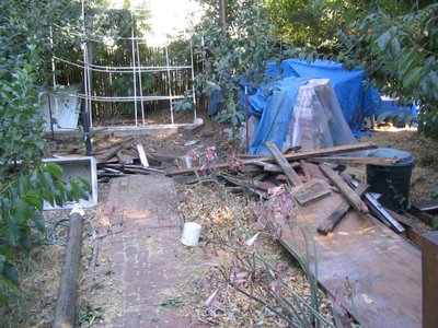
In talking with Magic about the possibility of adding walls and a roof to the platform they had proposed, they were receptive to the idea in part because there was this old, defunct greenhouse sitting at the back of the middle property that I could tear down and replace with my dwelling. This was beneficial since it meant that the neighbors were less likely to be bothered by it, since it wasn't a new structure, it was just replacing an old structure. I proceeded to tear down the old greenhouse over the course of three days, and although I neglected to get a good picture of the greenhouse before I tore it down, here is a photo of the site right after I had the greenhouse down. It doesn't look like much, but it has cleaned up quite nicely since then:
Design 1:
Unlike the siting, which was quite limited, the design is as open and free as I what I can imagine, except for three constraints:
1) According to city law, you can build something with a roof-projection of fewer than 120 square feet without a permit. There was no way I was going to go through the hassle and cost of getting a permit, so 120 square feet was my ceiling, literally and figuratively.
2) Magic wanted my house to be easy to disassemble, so that if it ever needed to be moved (for example in the case of a remodel of the front house that puts the maximum allowable square footage of the property over the limit) it could come apart in sections and be taken elsewhere.
3) It has to be physically possible with the materials available, and it has to be sufficiently strong that it’s not going to fall apart.
With those three design constraints in mind I started to think about what to build. At this time I was still waiting on that job, going through the whole application/interview process and all that jazz, and so I wanted something that I could put up fairly quickly in case I got the job and needed to start working full time before the house was completed.
In order to be able to put it up quickly, simplicity was key, as was the need to use pretty conventional materials that were easily obtainable. I had gotten pretty excited about green building the past winter when I took Gil Masters' Green Building class (the best class I took at Stanford, by the way), but I found that a lot of the principles of green building weren't suited to a building that was so ephemeral, both in construction and planned lifetime.
To make the design, I turned to this architectural drawing program called Google Sketchup to make a quick 3d model. I threw together my first design in a couple hours. It was aimed at being able to fit within the exact site of the old greenhouse without having to damage either of the two apple trees that were growing next to the greenhouse. I also didn't have an idea of what windows were available (Magic has a bunch of nice double pane windows they had salvaged off of a remodel in the neighborhood), so I just threw some space filler windows into the model. Here's what it looked like:
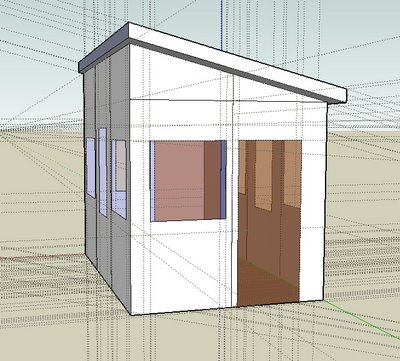
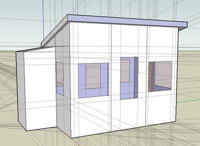
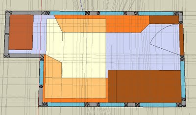
The design is basically a very simple shed design, with just enough room for a queen sized bed, a small closet, a large desk, and some additional storage and seating underneath the bed (which lifts up on pulleys to the ceiling during the day and descends at night). The plan was to set the building on precast concrete piers leveled on compacted ground - about as easy and lightweight a foundation as you can get. Here's the floorplan:
Design 2: After having the original design roll around in my head for a little while, I realized that it was going to be kind of cramped and a little awkward. I decided it needed a redesign, but before that I went and took a look at what windows were actually available so I could incorporate the windows into the new design.
Furthermore, as the wait on that job was getting longer, my perspective on this house and what it meant were slowly changing. It was becoming less about throwing something up to live in, and more about the process and the statement building it would make, regardless of how long I spent living in it. I started to think more and more, that if I were really excited about green building (which I am), then I could find inventive ways to incorporate the principles of green design if I tried hard enough.
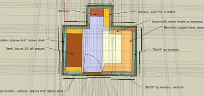
With those changes in perspective partially underway, I made this second design, which didn't fit quite as well on the old footprint of the greenhouse, but was much more satisfactory. At first glance, the structure seems very similar, but there are some very important tweaks that have major effects, such as rotating the building 90°, and putting the door on one of the long sides. Furthermore, I made some additional specifications that were undetermined in the original, like deciding on straw-clay insulation, and metal roofing. It was starting to become more of something to be proud of, rather than just something to throw up and live in for a while. Here's what it looked like:
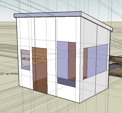
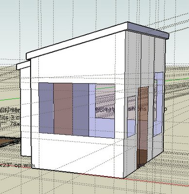
And the floorplan:
Siting 2:
After creating the second design, there came up the issue that the Magic folks and I had never really nailed down exactly where the building was going to be sited. I had always assumed that the building was going to go right onto the old site of the greenhouse, but in reality that was not the most satisfactory site for either them or me. For them, it limits the way they can use the site into the future, and for me it necessitates taking out an apple tree that I would rather leave in.
Just 15 feet to the northeast of the old greenhouse site (to the left in the picture above) was a kind of alcove nestled between a medium sized oak and another structure in the backyard. If I built on the greenhouse site, that alcove would be mostly closed off and would be trapped space, but if I built in the alcove, it would open up the rest of the yard nicely. After wandering around with a tape measure for a while, we decided that there was just enough space in the alcove, and agreed on building there.
Design 3:
Concurrent with nailing down the final siting, I found out that I didn't get the job I had been hoping to get since July (yes, it was a very long, drawn out process). With those two events happening nearly simultaneously, something just kind of rolled over in my head, and my perspective on this little cottage made the final transition to what it is now, as I'm writing. Now, I see this as much more than just an opportunity to build a cool place to live - its an opportunity to try out innovative and experimental green and natural building techniques, to see whats possible, in a sense.
With that in mind, I went back to the Magic folks (Magic makes decisions by consensus, so that’s why I'm not naming a single person here) and proposed a slightly more permanent structure, mostly making changes in the foundation, which they were supportive of. I went from a very lightweight, impermanent foundation of concrete piers to what is definitely experimental: earthbags over rubble-trench with a polished adobe floor. Combine these experimental/alternative techniques with an experimental version of light straw-clay infill walls and ceiling and this dwelling has gone from a cheapo thing thrown up as fast as possible to a full-fledged hybrid natural building - far more comfortable and healthy and with a chance at real permanence.
Ok, if you couldn't tell, I'm pretty psyched about this new design. So psyched, in fact, that I keep making tweaks to it, and thus don't have a good version to put up here on the web just yet. I'll get to it soon, so keep and eye out for it, especially since breaking ground is just around the corner.
No comments:
Post a Comment